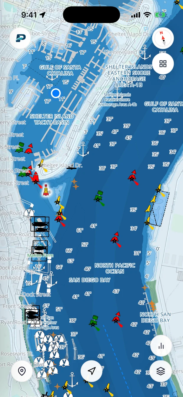
A nautical chart is a map of the water, and the most important stuff on it is what you can't see from the deck: how deep it is, where the hard bits are, and how the buoys walk you through. Learn a handful of conventions and the rest falls into place.
Soundings and depth
The little numbers scattered across the water are soundings, the depth at that exact spot. They're measured from the chart datum (MLLW in the US), a low-water line, so the real depth is usually a bit more than printed by however much tide is in. Check the units in the chart's title block before you trust a single figure. Feet, fathoms, and meters all get used, and mixing them up is how boats end up aground.
Colors and contours
Charts shade the water by depth so you can read it at a glance. Roughly:
- Dark blue is shallow.
- Lighter blue is a little deeper.
- White is deep water.
- Green is ground that dries out at low tide, like a mudflat or sandbar.
- Tan is land.
The lines between the shades are depth contours, joining points of equal depth. Following a contour is one of the oldest tricks for staying in safe water.
Buoys, beacons and lights
Aids to navigation appear as small symbols with shorthand for their color, shape, light, and sound. Red marks are drawn in magenta or as diamonds, green in green. A lit mark gets a magenta teardrop and a light description like Fl R 4s, which reads "flashing red every 4 seconds." Our guide to US buoys covers the whole system.
Hazards worth knowing on sight
- Rocks show as an asterisk or a cross. One that covers and uncovers with the tide gets a dotted circle.
- Wrecks look like a hull or a little diagram with masts, sometimes circled if they're dangerous.
- Obstructions carry the label Obstn, often with a depth.
- Foul ground is a messy patch that's no good for anchoring.
Scale and position
The scale, say 1:40,000, tells you how much detail the chart packs in. A smaller second number means finer detail over less area. The borders are marked in latitude up the sides and longitude across the top and bottom. One handy fact: a minute of latitude is a nautical mile, so the side of the chart doubles as a distance ruler.
Paper vs the screen
A chartplotter or app renders the same official NOAA data, drops your GPS position on top, and lets you zoom and plan a route. Pathr builds on NOAA charts, overlays live wind, waves, and radar, and routes around the shallows for your draft. It's free to try for two months on iOS and Android, and you can pull up tide charts right here.